FEDERAL TRADE COMMISSION WEBSITE REDESIGN
Step 1
Our goal was to redesign the Federal Trade Commission website within 3 weeks time and to the best of our ability. With having just connected as a group, and many of us unfamiliar with the use of the FTC, we knew we were going to have to work hard to catch up.
Step 2
Understanding the Project
This government service and website was picked for us. We knew in order to redesign the FTC well we would have to learn as much as we could about the business model and user base. This project was going to be tricky, between connecting with real time users or businesses, as well as redesigning the site for both.
Our Tasks
Step 3
How To Start
Research and User Analysis/Persona
- We dove straight into research, first looking at what kind of users would use the FTC and what they then may be looking for in terms of UX.
- We started with creating a FTC map to lay out the users and a proto-persona to understand our users better.

Step 4
Understanding the User
User Persona
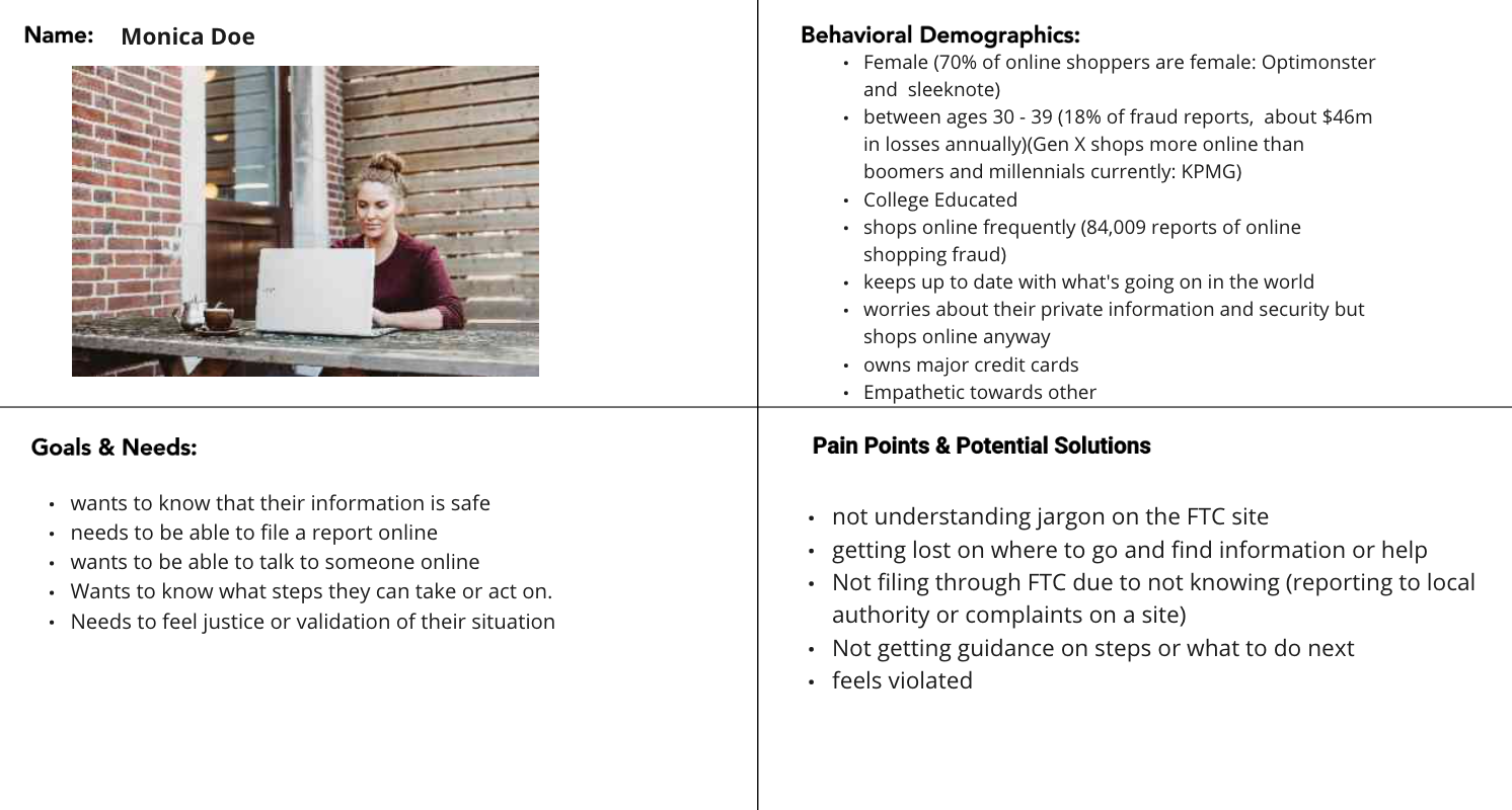
We realized that using the perspective of both businesses, big and small, as well as consumers was going to be a big task. While we looked at the business understanding of the site, we focused more on the consumer.
Our proto-persona Monica, wants to be able to file a report but feels the site is confusing and has a lot of jargon.
Step 5
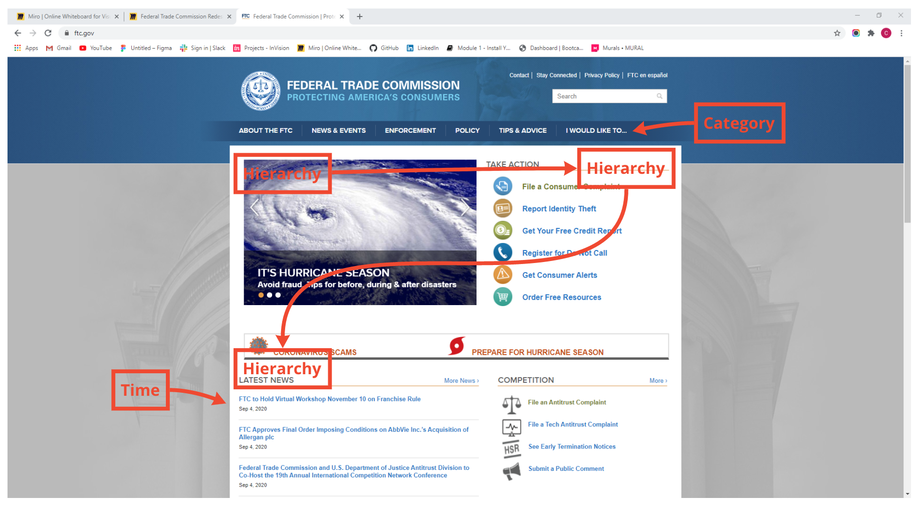
Testing and Heuristic Analysis
For our testing, we did usability testing within the site itself with consumers we had connections with. We then got into the Heuristic Analysis, where we outlined and redlined the problem areas as well as the systems we saw within the site, such as Hierarchy's, Time, Categories, use of White Space and other organizational styles laid out within the site.

Step 5
Affinity Diagram, Feature Prioritization Matrix and Moodboard
The next step for our team was to organize our research and thoughts from the testing through an Affinity Diagram and then to prioritize various features over others, as well as a moodboard for ideation and brainstorming.
Affinity/Feature Matrix
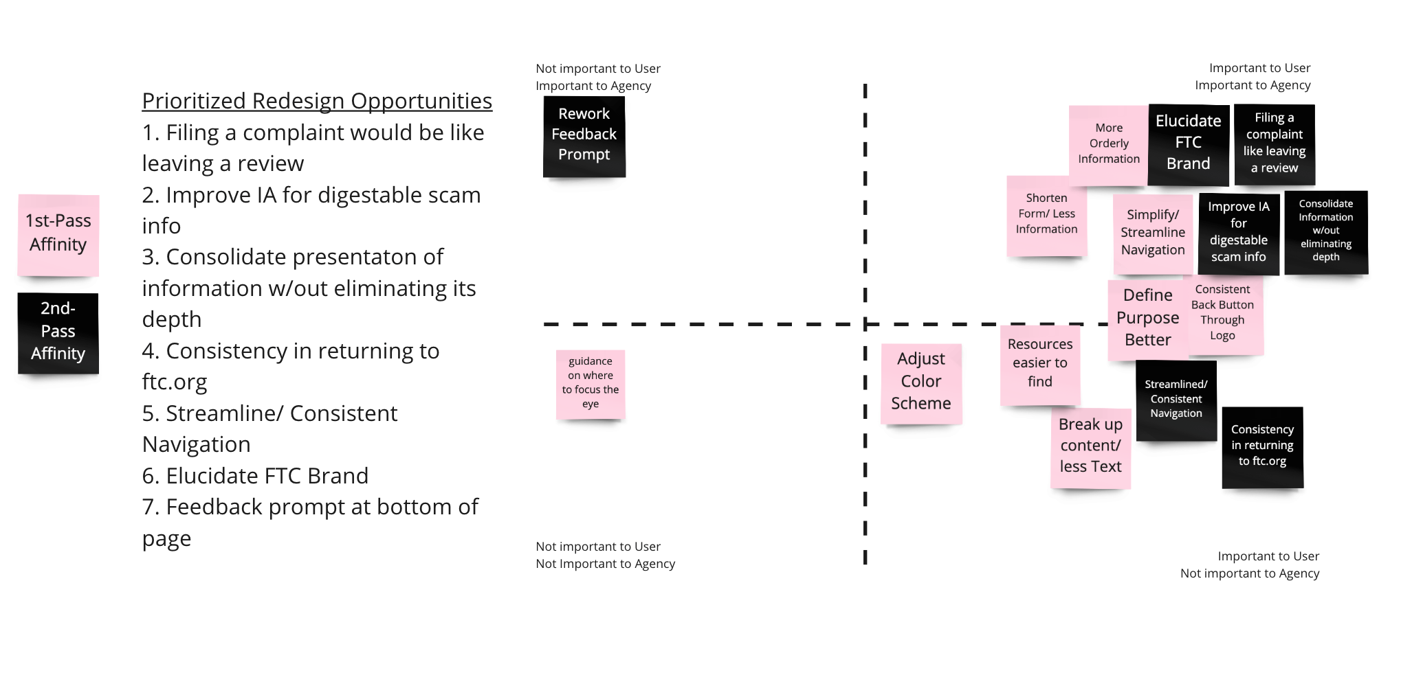
This diagram above is a combination of our Affinity Diagram, where we recorded and organized our research and a Feature Prioritization matrix, which helped us determine which features to include and which to leave out that would allow for the best user flows and experience on the website.
Moodboard
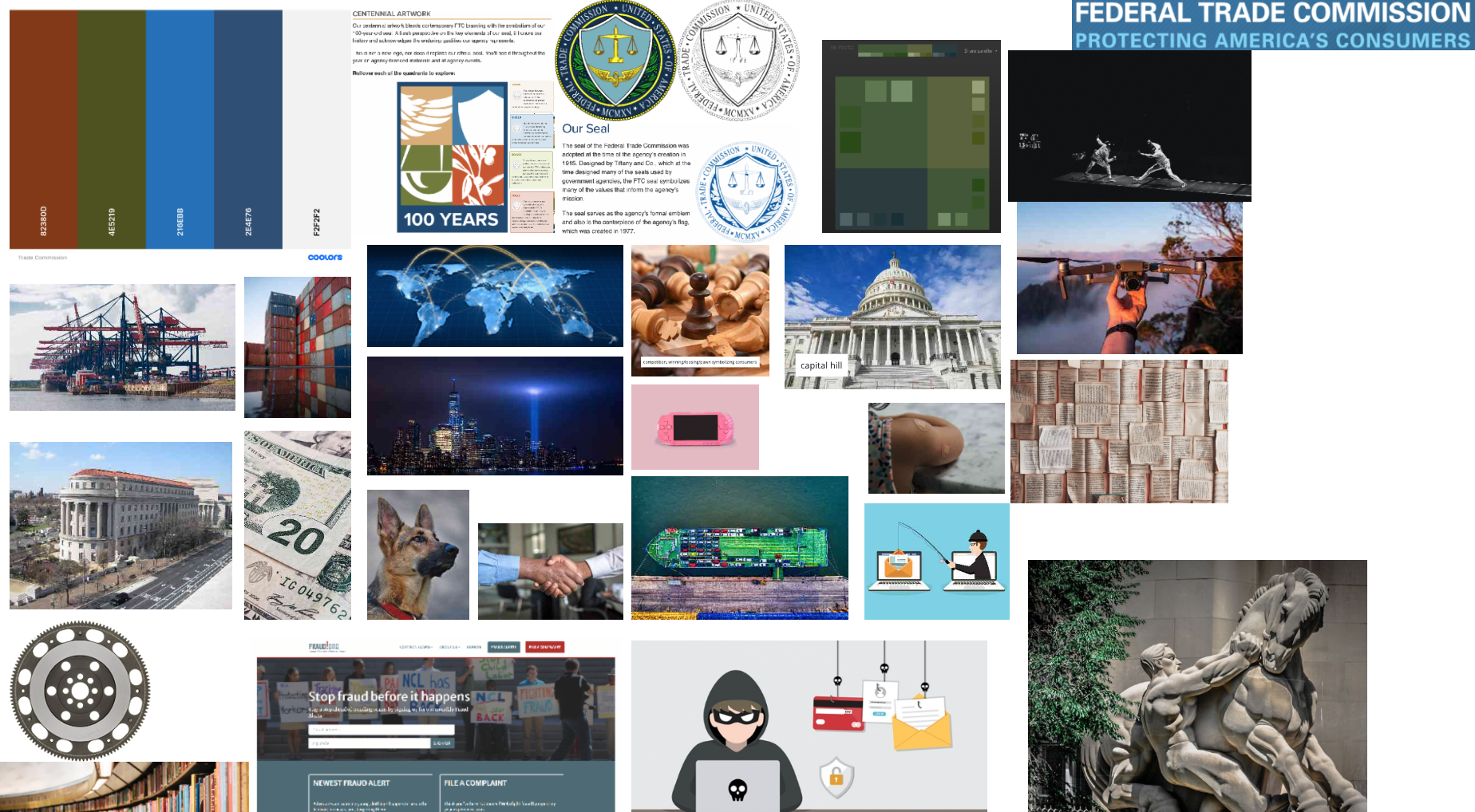
We then needed to get some color and life to the site. With all of our previous research and information about the FTC, consumers and businesses, we created a moodboard with inspirational ideas and images to give us a visual direction.
Step 6
Site Map, Sketching, Lofi Wireframing
We then took on the huge task of reorganizing the Information Architecture and Naviagtion, as well as start on the Lofi Wireframing.
Site Map
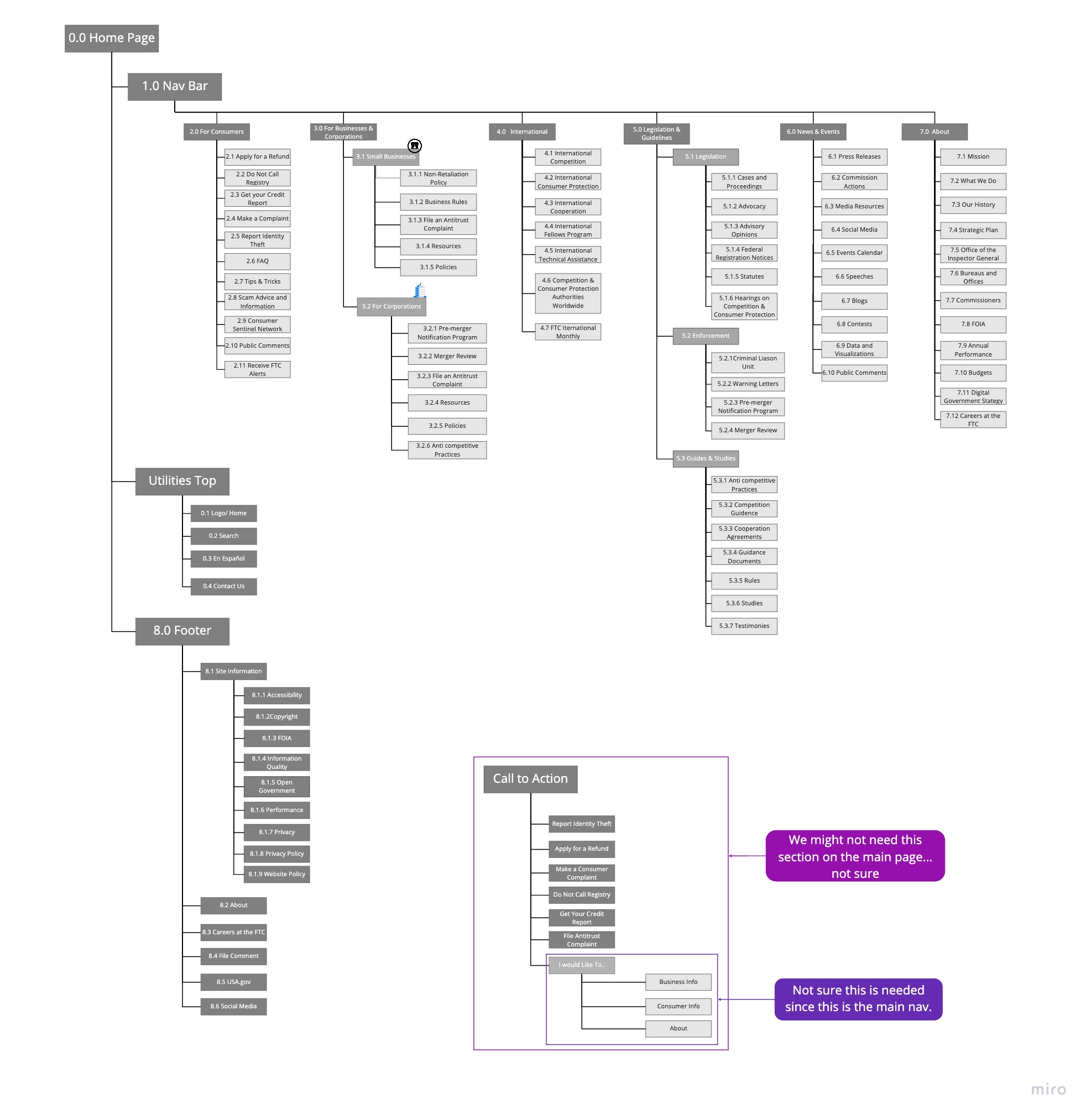
After a card sorting technique, we reorganized the information architecture of the FTC website. This meant we had to write down the orignal navigation within the site and then reorganize it in the way that made the most sense. Since this is a federal government, this took a while to sort out.
Lofi Wireframes
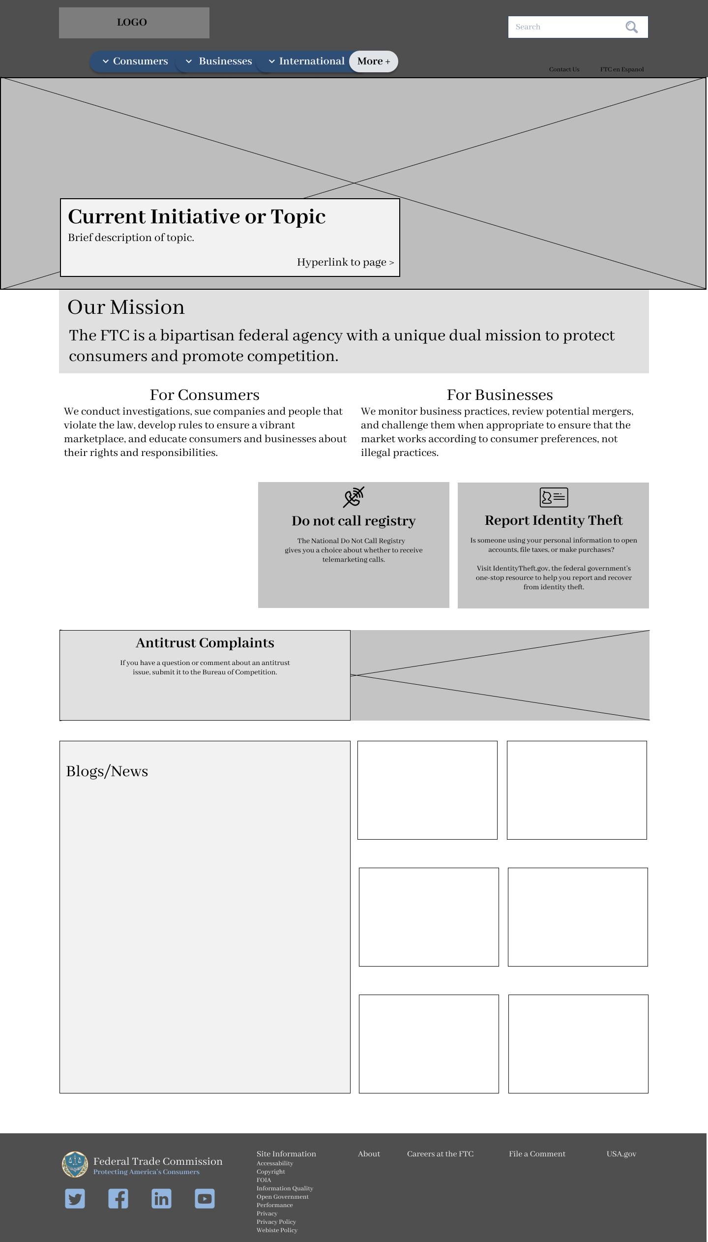

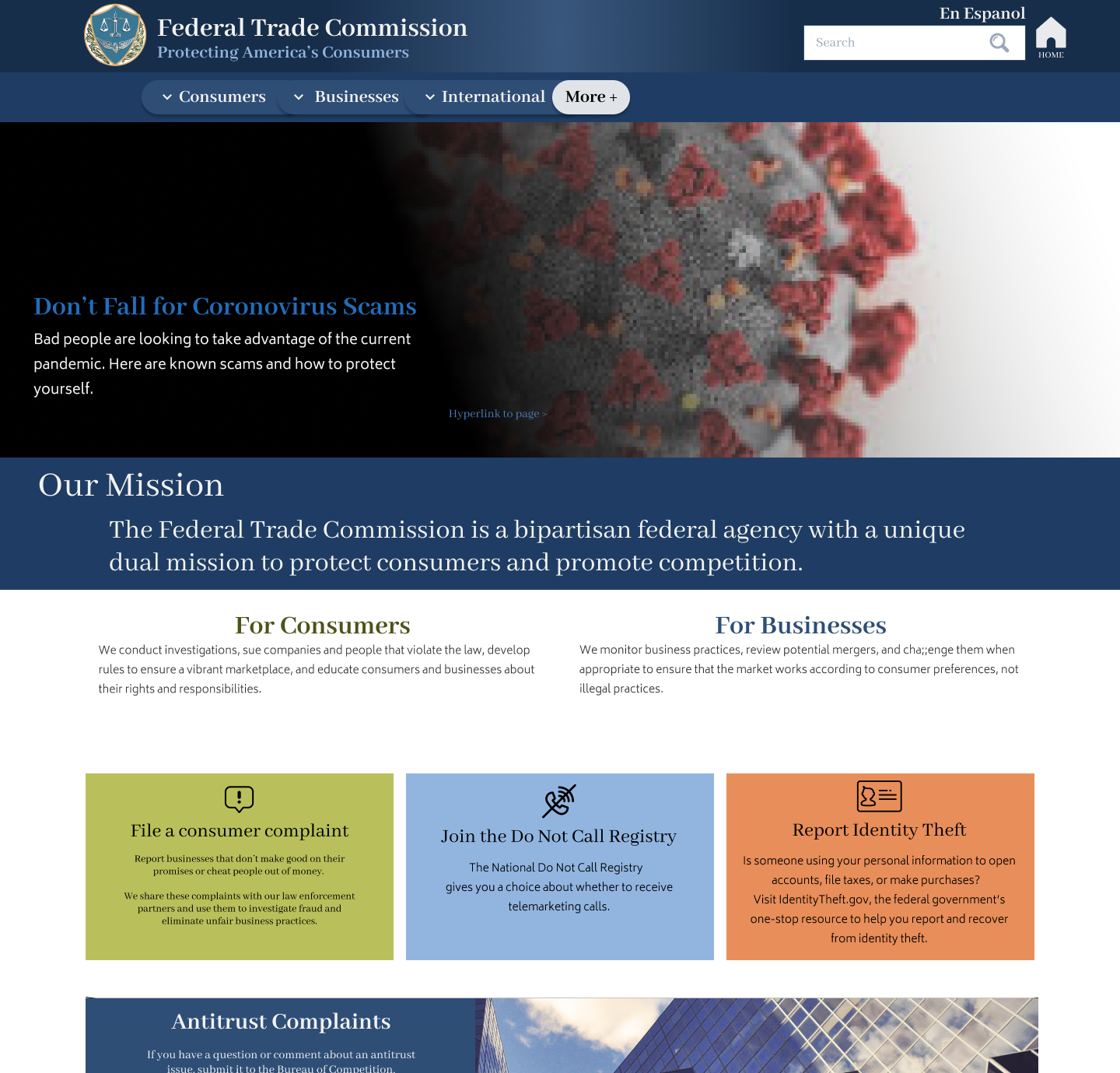
We then moved into our sketching and lofi Wireframing. Pictured above is an image of our home page during out Lofi Wireframe stage.
Step 7
Hi Fidelity Wireframe and Prototype
After a user test for usability and interaction purposes with the Lofi Prototype, we started working on the Hi Fidelity Wireframing/Prototype.
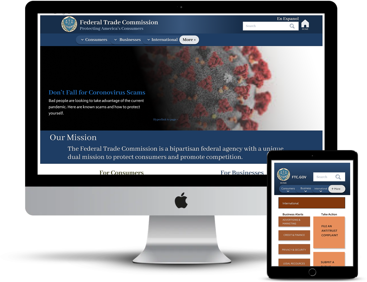
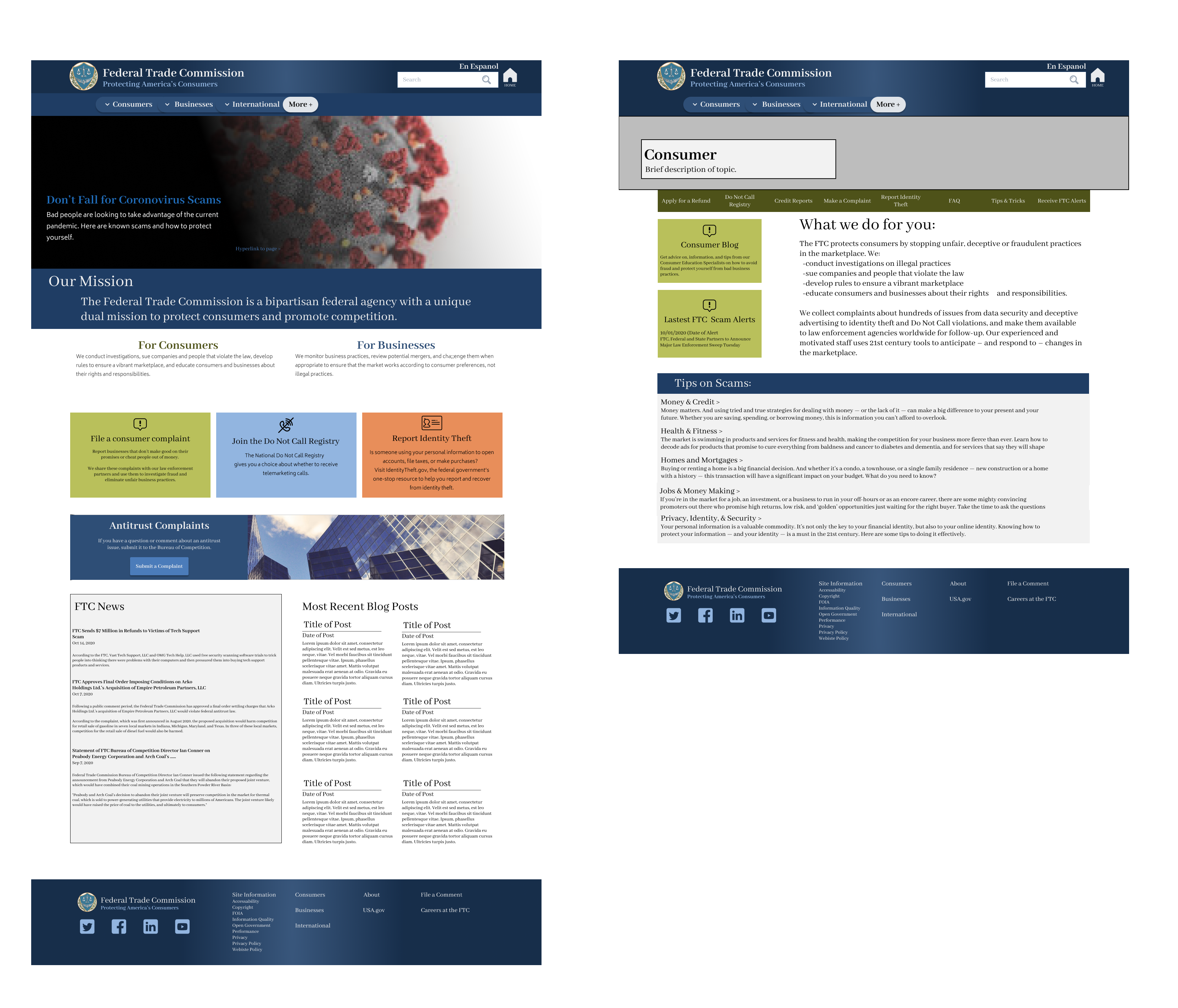
Hi Fidelity Desktop Prototype
Hi Fidelity Mobile Wireframes
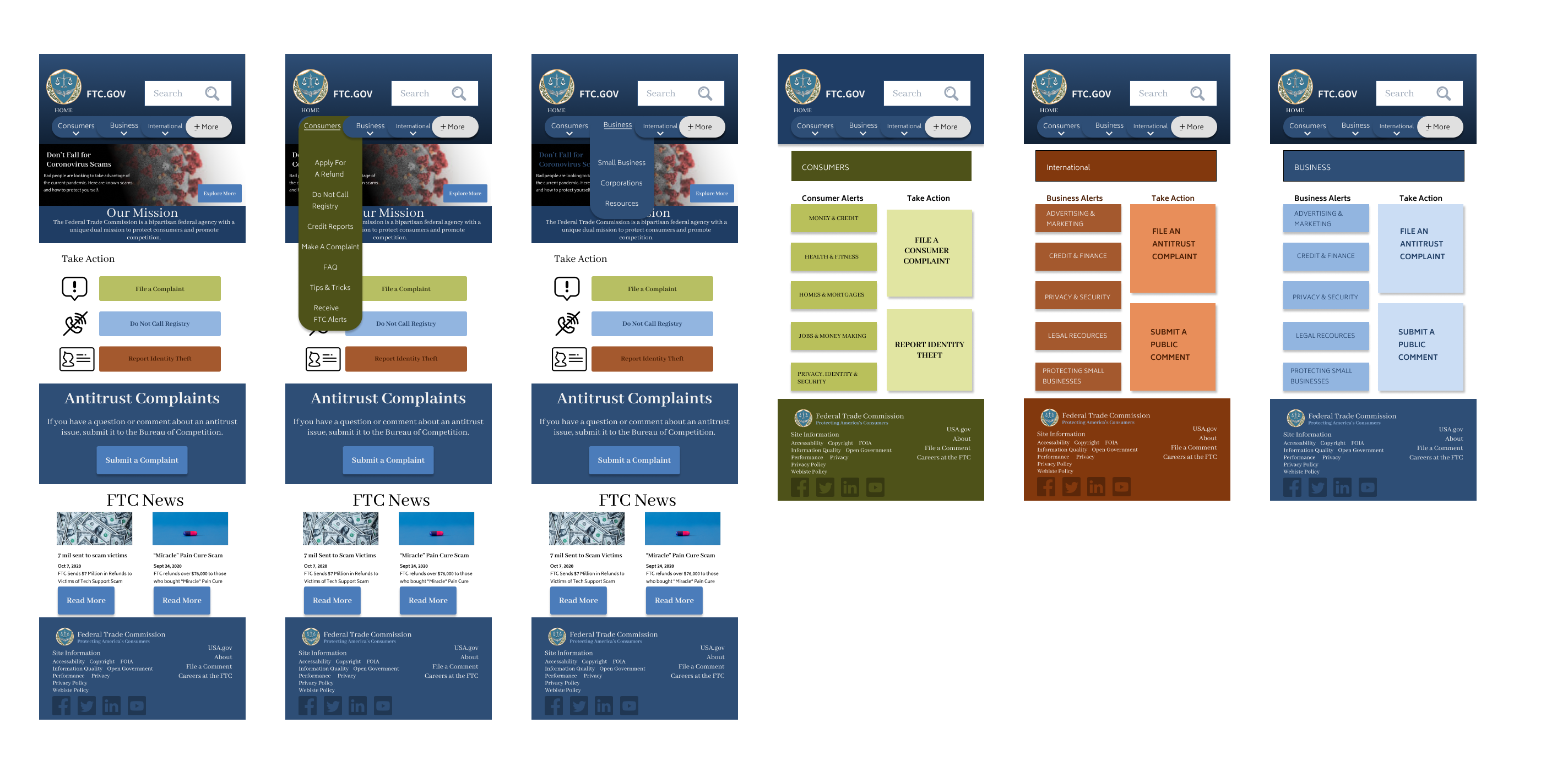
Our Hi Fidelity Prototypes shown above, were designed with easy navigation and simple clear layouts with the same branding found on the original FTC site, yet with a bit more energy in the coloring.
Step 8, 9 and 10
Final Testing and Iterations
After finishing the hifi prototype we did a number of in-person user tests for both the mobile and desktop versions of the redesign.
Testing Results
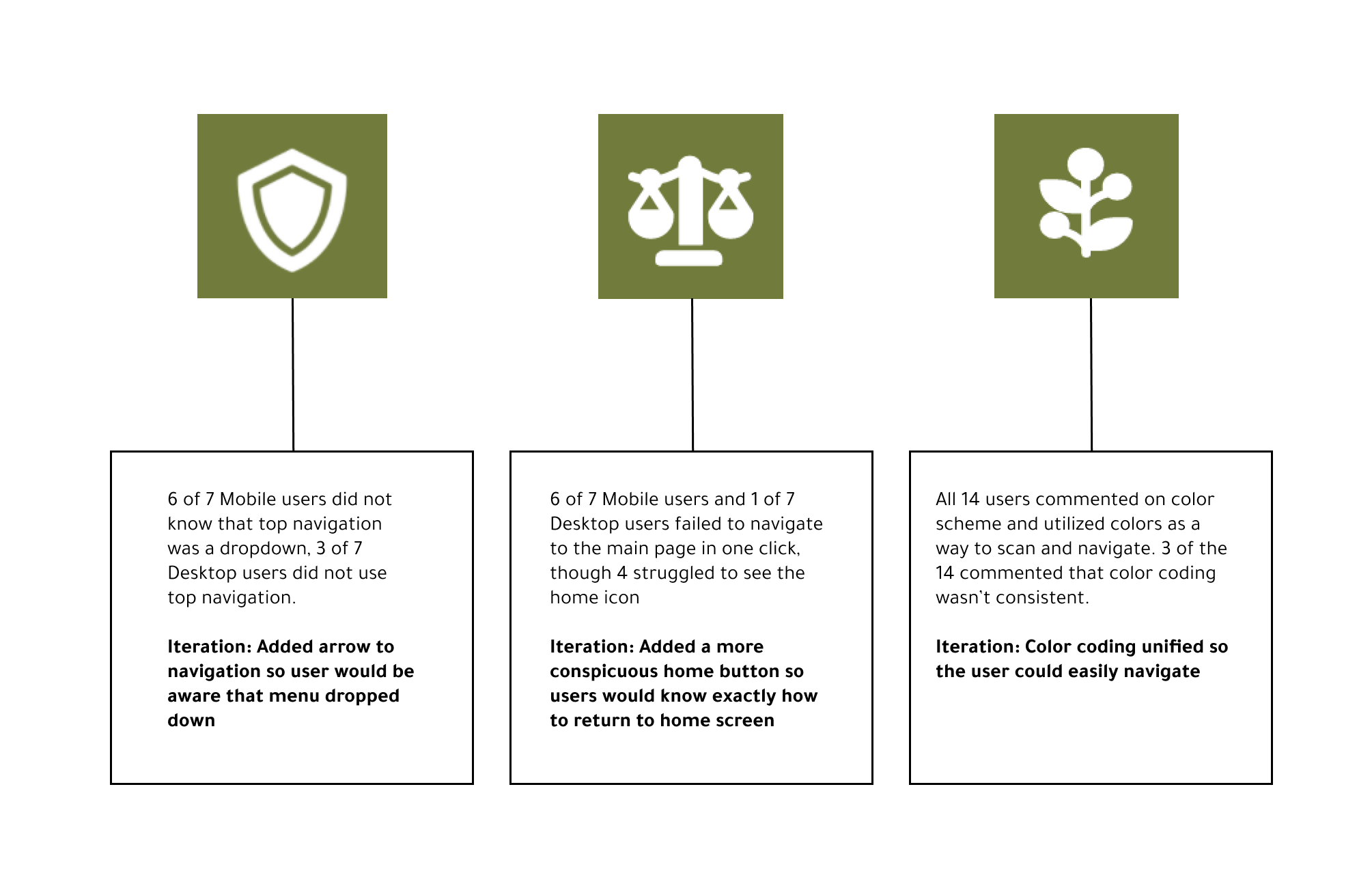
Our final user testing gave us a good sense of what we needed to focus on next for iterations. These iterations as listed above, consisted of clearer navigation signalling, with a specific home button, and more cohesive coloring.
More Iterations
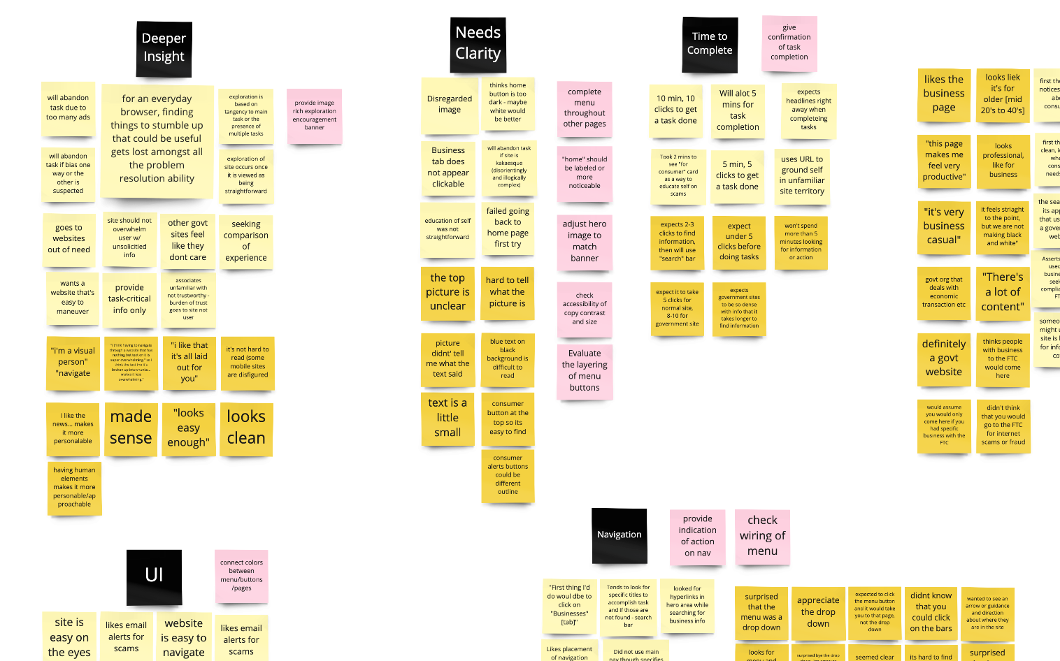
Our iterations never ended for this project... We learned what people liked, disliked, wanted and hated on our redesign. Unfortunately, we ran out of time here but our creative process never ended. Here are a few of the deeper insights we got and additional perspectives.
From This

To This.... and More
Tools and Final Thoughts
Tools
Figma, Miro, Adobe XD, Adobe Photoshop, Slack, Zoom, Google Slides, Google Sheets, Google Forms, UnSplash, Dribble
Final Thoughts
This project shifted and changed every day we worked on it. At the beginning, we had to figure out the best direction for empathizing with the user while recognizing the website as a government agency. With the amount of information on government website pages, the was a unique project. Everyone on the team had our own stengths, however we collaborated on each part equally.
The takeaway for me was the challenge of interpretting a large amount of information on a website like this and the confusion that comes with it, and how to reorganize and format for everyday people, just like myself. I learned a lot and I can't wait to explore more projects like this.